Quick Answer
What makes a cursive join readable and easy to execute?
A readable cursive join carries the exit of one letter into a clear entry for the next without closing counters, distorting the following letter, or erasing the space between words. Not every combination needs an uninterrupted stroke. Practise a short pair, compare the connection height and next-letter shape, and keep a practical pen lift when it improves clarity.
The most common breakdown in cursive handwriting occurs during letter transitions. Individual letters look clean in isolation, but when strung together, loops collapse, counters close into solid blots, and words turn into illegible wave lines.
Cursive is not an endurance test of writing without ever lifting the pen. In motor learning research (Van Galen, 1991), fluent cursive relies on smooth motor chunking—combining exit and entry strokes at the correct vertical coordinates while preserving the open spaces inside each character.
What is a cursive join?
A cursive join (or ligature) is the physical transition stroke that connects the finished exit of one letter to the initial entry stroke of the following letter. It is not an arbitrary decorative flourish; it is a movement bridge.
To maintain legibility, a join must satisfy two strict criteria:
- Counter Protection: The connecting stroke must never slice through or close the internal loops (counters) of letters like a, d, g, o, e.
- Structural Independence: The join should remain visually lighter than the main downstrokes so the eye easily parses distinct characters rather than seeing an undifferentiated zigzag.
Why does connection height change the next letter?
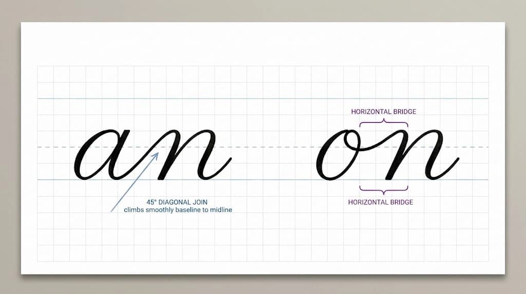
The primary reason writers struggle with cursive joins is failing to recognize that letters exit at two completely different vertical coordinates: the baseline and the midline.
1. Baseline Exits (Bottom Climbs)
Roughly 70% of lowercase cursive letters finish at the baseline: a, c, d, e, h, i, k, l, m, n, t, u. Their exit stroke sweeps upward at an angle of 35°–45° toward the midline. These are predictable because the pen always starts its climb from a stable bottom anchor.
2. High Midline Exits (Horizontal Bridges)
Four crucial letters end at the midline: b, o, v, w. Their final stroke finishes suspended in the air. The cardinal rule of high-exit letters is: never drop back down to the baseline. The pen must travel horizontally across the midline to meet the top of the next letter.
Which joins commonly close counters or flatten loops?
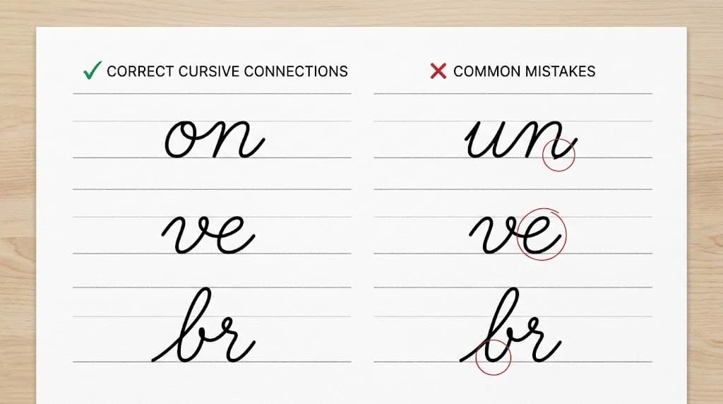
When writing speed increases, three specific join types frequently collapse, creating severe legibility bottlenecks:
| Vulnerable Pair | Mechanics Hazard | Preventative Technique |
|---|---|---|
| High-Exit + e (ve, we, oe, be) | High ligature cuts through 'e', flattening its loop into a solid knot | Dip the bridge slightly before looping up to keep the eye of 'e' open |
| Reversal Joins (ca, co, da, ga) | Over-speeding creates clockwise shortcuts, turning 'a' into an '8' | Touch the top-right curve, pause briefly, then retrace counter-clockwise |
| Descending Loops (gy, py, gg) | Oversized lower loops collide with ascenders on the writing row below | Keep descending tails compact, returning directly to baseline |
When is a pen lift practical?
A pen lift is not a sign of failure; it is a standard biomechanical tool. Forcing an entire 10-letter word without lifting the pen forces the wrist into extreme deviation, causing muscle strain and degraded line quality (Graham & Weintraub, 1996).
Apply pen lifts strategically in four scenarios:
- After Capital Letters: Most uppercase cursive forms (T, F, P, B, D, W) do not naturally flow into lowercase baselines. Lift after the capital and start the lowercase word cleanly.
- At Syllable Breaks: In multi-syllable words (e.g., con-nec-tion), brief micro-lifts allow the writer to slide the hand to a fresh pivot anchor without breaking visual flow.
- Before Awkward Digraphs: Combinations like q-u, z-z, or r-s can feel anatomically cramped. A 1-millimeter micro-lift eliminates torque on the fingers.
- Crossbars and Dots: Never interrupt the flow of a word to cross a t or dot an i. Finish the full word stem first, then dot and cross in one quick finishing pass.
How should short pairs progress into words?
Do not practice cursive by writing long, complex paragraphs immediately. Motor control builds in layers: from isolated 2-letter digraphs to short core words, and finally to rhythmic whole words.
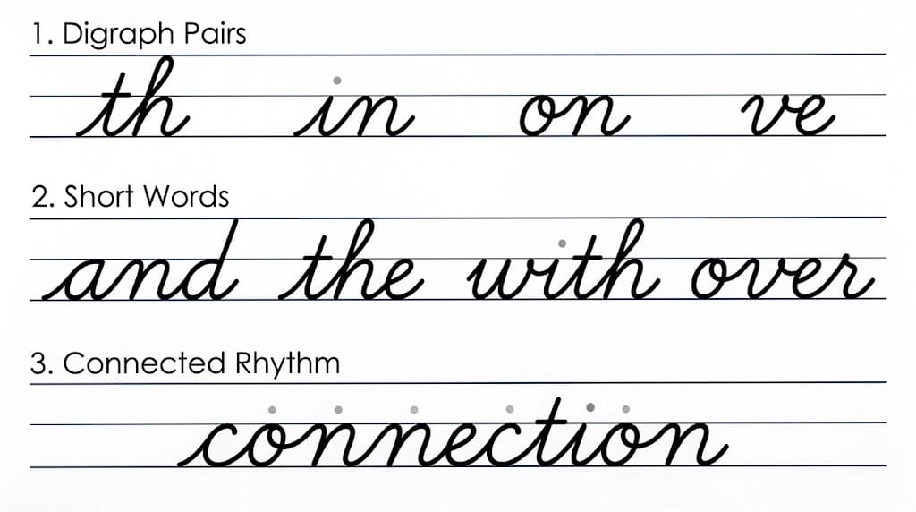
To practice structured connection sequences, use the curated exercises in our Cursive Connections Foundation Pack, which categorizes practice by baseline and high-bridge exits. If you want to drill custom names or specific vocabulary, you can generate custom dotted lined sheets with our cursive worksheet generator.
How do slant guides help—and when should they be removed?
Diagonal slant guides (typically ruled at 55°–68°) provide a visual reference for parallel downstrokes. They are useful when calibrating letter lean across ascenders (l, b, h, k) and descenders (f, g, p, y).
However, slant guides should be removed when:
- The writer forces a slant so steep that letter counters (like e, o) become compressed.
- Hand movement becomes stiff and slow because the writer tries to align every single stroke with the line.
A variance of ±5° across downstrokes is completely acceptable. The goal is visual harmony, not mechanical rigidity.
How can you check joins without judging the whole word?
Instead of assessing a cursive word as vaguely “messy” or “neat,” evaluate three objective mechanical markers:
- Counter Openness: Look at all rounded letters (e, a, o, d, g). Are the internal white spaces clean and identifiable, or have ligatures filled them with ink?
- Bridge Flatness: Inspect high-exit transitions (on, or, ve, wi). Did the connector stay at the midline, or did it drop into an artificial valley?
- Inter-Letter Rhythm: Check the horizontal span between letters. Is spacing uniform (roughly the width of a lowercase “o”), or do characters cluster unevenly?
If you want an objective measurement of your letter formation and consistency, you can upload a sample to our AI handwriting analysis tool to pinpoint specific letter distortion and spacing irregularities.
Frequently asked questions
Do all cursive fonts connect letters the same way?
The underlying movement mechanics (baseline climbs and high-midline bridges) are universal. Variations occur primarily in entry flourishes: traditional Spencerian includes extended lead-in curves, while modern models like Prima Cursive use economical, unadorned entry strokes to maximize legibility.
Why do my hand and wrist ache during connected writing?
Pressure and forearm position are practical things to check during connected writing, but a handwriting sample cannot establish why a hand or wrist aches. Keep practice comfortable, pause if it hurts, and seek qualified advice for persistent or worsening symptoms.
Why does the letter 'r' look strange when joined?
In standard cursive, lowercase r develops a top horizontal shoulder so the ligature can exit smoothly to the right without descending. Once you treat the shoulder as an exit platform at the midline, the motion becomes natural.
Sources & References
Explains how cursive letter transitions form discrete motor chunks and why excessive continuous motor commands increase trajectory noise.
Reviews empirical legibility factors in cursive penmanship, showing that unforced pen lifts do not compromise writing fluency.
Demonstrates the biomechanical planning required when transitioning between baseline climbs and suspended midline strokes.
Highlights how brief micro-lifts reduce hand fatigue and allow writers to recalibrate spatial coordinates during connected script.