Quick Answer
Why is my handwriting so bad?
Bad handwriting is rarely about talent — it's about inconsistent spacing, uneven letter heights, and broken visual rhythm. Your brain perceives text as 'messy' when baseline alignment, x-height ratio, and inter-letter spacing vary unpredictably, increasing cognitive load for the reader.
The most common misconception about handwriting is that to have "good" handwriting, every single letter must look like a calligraphy masterpiece. But why do we inherently look at one piece of paper and think "beautiful," and another and think "messy"?
If you want a practical, guided path instead of guesswork, try our AI handwriting evaluation and training tool to identify your top issues and get targeted drills. Your first basic analysis is free.
Why Does Our Brain Interpret Some Handwriting as "Ugly"?
The human brain is an advanced pattern-recognition machine. When we look at text, we aren't just reading words; our visual cortex is subconsciously analyzing the geometry of the shapes.
What Causes the Cognitive Load of Broken Rhythms?
According to Gestalt Psychology, our brains prefer order, symmetry, and continuation. When text is written with consistent height, spacing, and slant, it creates a predictable visual rhythm. The brain can process this rhythm effortlessly.
"Ugly" or "messy" handwriting is simply Visual Noise. When letters vary wildly in size or bounce off the baseline, the reader's eye has to constantly micro-adjust its focus. This breaks the expected pattern and forces the brain to spend extra "GPU cycles" (processing power) just to identify the letter forms, rather than comprehending the meaning.
The Friction of Perception
In Human-Computer Interaction, Cognitive Load Theory dictates that interfaces must minimize unnecessary cognitive friction.
Your handwriting is an interface. When we subjectively feel that handwriting is "bad," what we are actually experiencing is the frustration of high cognitive friction. We interpret inefficiency as ugliness.
What Are the 4 Core "Bugs" That Make Handwriting Look Bad?
If "ugly" is just a lack of visual predictability, we can debug it by breaking down the geometry of handwriting into four distinct dimensions. Which of these bugs is running in your muscle memory?
| The Handwriting Bug | The Visual Symptom | UI/UX Equivalent |
|---|---|---|
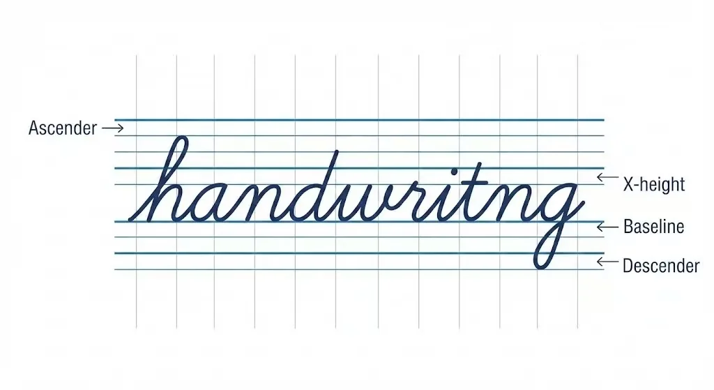
| 1. Baseline Jitter (Y-Axis Tracking) | Words look like they are floating up or sinking down. The text cannot hold a straight horizontal line. | Vertical-Align Failure |
| 2. X-Height Collapse (Proportion) | Lowercase letters (a, e, o, m) are drastically different sizes. A tall 'a' next to a tiny 'e'. | Font Scaling Error |
| 3. Random Slant Variance (Angle) | One letter leans left (45°), the next leans right (110°), the next is strictly vertical (90°). | Transform: Skew() Chaos |
| 4. Irregular Kerning (Negative Space) | Letters are crammed together in one word, and drifting apart in the next. The white space is ignored. | Inconsistent Margin/Padding |
Why Is "Negative Space" the Secret to Legible Handwriting?
Most people only look at the ink (the positive space). But the human eye evaluates proportion based on the empty paper inside and around the letters (the negative space, or "counters" in typography). If the loop of your 'e' is crushed, or the space between 'h' and 'e' is too wide, the geometric balance is destroyed.
Why Does the Hand Fail to Execute What the Brain Intends?
If our brains know what a straight line looks like, why does the hand fail to draw it? This bridges the gap between intention and execution—the Fine Motor Skills bottleneck.
- Drawing from the Wrist, Not the Arm: Many people with messy handwriting "plant" their wrist on the table and only move their fingers. This creates a highly restricted radial arc. As you write across the page, your baseline naturally curves downward because your fingers run out of reach.(For a deeper dive into physiological mechanics, see our Ergonomic Fatigue Analysis).
- Speed vs. Accuracy Trade-off: You are trying to run a program faster than your hardware allows. When you write quickly, your motor system cuts corners, turning sharp angles into sloppy curves and failing to close loops (e.g., an 'o' looking like a 'u').
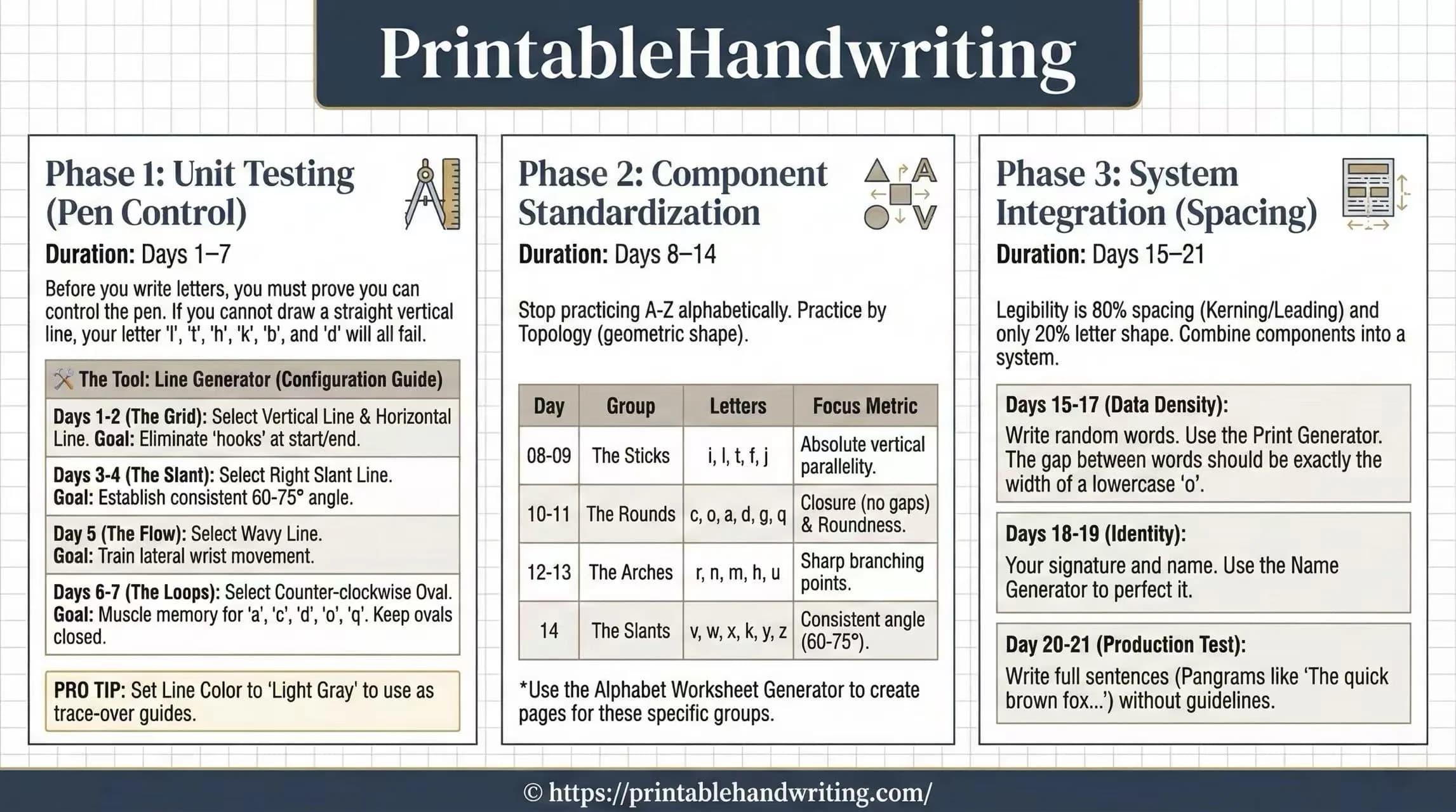
How Do You Fix Messy Handwriting with a Structured Approach?
Now that you understand the root causes—geometric inconsistency and fine-motor failure—how do we fix it?Telling someone to "just write neater" is useless. You need a structural approach to retrain your neural pathways.
Phase 1: Regain Stroke Control (Stabilize)
Before you worry about writing words, you need to prove your hand can draw the shapes that make up words. Spend 5 minutes a day drawing deliberate straight vertical lines, horizontal lines, and perfect circles. Do not rush.
Phase 2: Standardize the X-Height
This is the highest ROI (Return on Investment) fix. Force every single lowercase letter (a, c, e, m, n, o, r, s, u, v, w, x, z) to be exactly the same height. Use paper with a mid-line (like French-ruled paper or primary school paper). Your only goal is to make sure the top of the letter touches the dashed line, and the bottom touches the baseline.
Phase 3: The Ghost Line Technique (Slant Consistency)
To fix random slanting, draw diagonal guidelines across your page at a fixed angle (e.g., 70 degrees) before you start writing. As you write, force the downstrokes of letters like 'l', 't', and 'h' to run parallel to these ghost lines.
Ready to Transform Your Handwriting?
Stop guessing what's wrong with your handwriting. Get an AI-powered analysis that identifies your specific issues with a complete 5-dimension radar chart and visual issue mapping. Your first basic check is free.
Also see our pricing for full reports starting at $3.99.
Conclusion: Beautiful handwriting isn't magic, and ugly handwriting isn't a permanent disease. It is simply physical control combined with geometric consistency. By understanding the visual psychology of pattern recognition and systematically practicing your baseline and x-height, anyone can refactor their handwriting system.