Quick Answer
Should you use four-line, three-line, or midline-only handwriting paper?
Use the least amount of guidance that still makes the current writing target visible. Four-line paper separates top, middle, baseline, and descender zones; three-line paper keeps a middle reference with fewer divisions; midline-only paper leaves a lighter surface once position is more reliable. A slant guide is optional—it is a reference, not a correction.
The useful question is not which paper is best in general. It is which marks on the page help you see the one thing you are practising today.
Handwriting guides are visual references. They can make a baseline drift, an oversized lowercase letter, or an inconsistent slant easier to spot. They cannot choose a stroke, fix a letter shape, or make a line of writing consistent by themselves. A crowded guide can also distract from the same problem it was meant to reveal.
This guide separates two decisions that are often mixed together: guideline style is the number and placement of reference lines; line height is the physical amount of vertical space between them. Choose the style for the information you need to see, then choose a height that gives the writing enough room to show it.
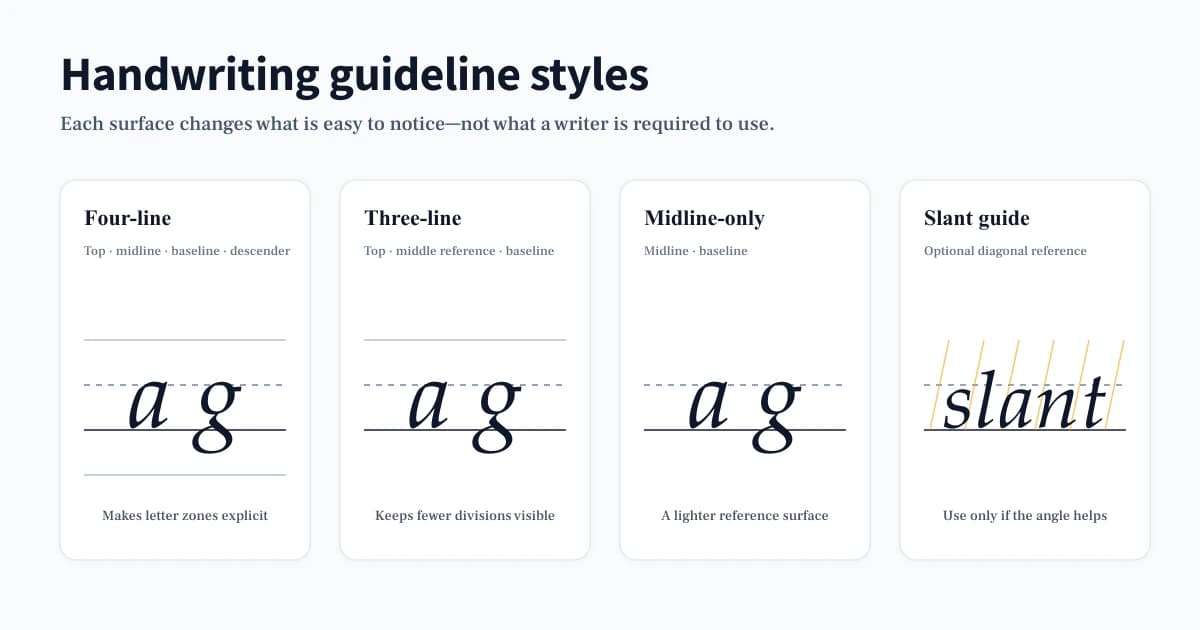
What does each handwriting guideline show?
Four-line, three-line, and midline-only paper all give a writer a baseline and a middle reference. The difference is how many boundaries remain visible around those two landmarks. More lines can clarify letter zones; fewer lines can make the writing surface feel quieter.
| Guide | What stays visible | Useful when you need to notice | Watch for |
|---|---|---|---|
| Four-line | Top line, dashed midline, baseline, descender line | Upper, middle, and lower letter zones | Treating every boundary as a mark to hit |
| Three-line | Top line, middle reference, baseline | Height and baseline with less page structure | Losing a useful descender reference too soon |
| Midline-only | Midline and baseline | Relative lowercase height on a lighter surface | Using it before letter placement is reliable |
| Slant guide | Optional diagonal reference across a ruled surface | Whether repeated stems lean in a similar direction | Forcing a diagonal that makes forms less clear |
When is a four-line guide useful?
A four-line guide is useful when the question is about where a letter sits. It separates the top, middle, baseline, and descender zones, so it makes it easier to compare a small letter such as a, an ascender such as h, and a descender such as g on the same line. It is a good reference when a writer cannot yet tell whether the issue is size, baseline position, or the shape itself.
Use the lines to inspect one feature at a time. For example, write a short row of a, c, e, m, n, then ask whether the small-letter bodies return to the same baseline and approach the same middle reference. Do not try to make every stroke touch every line. The aim is readable proportion, not mechanical contact with the grid.
When can three-line paper reduce visual clutter?
Three-line paper retains a top boundary, a middle reference, and a baseline while removing the separate descender boundary. It can be a useful next step when upper and middle zones remain worth checking but the fourth line has stopped adding information. In practice, this often happens when letters already return to the baseline but the page still needs a visible reference for relative height.
It is not a graduation badge. If descenders start drifting or long letters lose proportion, returning to a four-line surface for a short comparison is sensible. Changing a guide is a way to test what the writer can manage without it, not proof that more structure was a mistake.
What is midline-only paper designed to reveal?
Midline-only paper leaves the baseline and a dashed middle reference visible, with more open space above and below. It is useful when the writer already places letters reasonably well and needs a lighter prompt for the main body of lowercase letters. The reduced structure makes inconsistencies more obvious because fewer lines compete for attention.
This is not a claim that midline-only paper is inherently more advanced. Some writers may prefer it for copying a short passage; others may need a fuller guide for the same task. Let the writing sample decide: if the zones are no longer visible in the writing, add one level of guidance back.
How do line height and guideline style differ?
Guideline style controls which reference lines appear. Line height controls how much vertical room sits between the top and bottom of one writing row. They should be changed independently whenever possible. A four-line guide can be wide or compact; a three-line guide can be wide or compact too.
On PrintableHandwriting, the available labels are objective measurements: Wide is 0.65 inch, Standard is 0.50 inch, and Compact is 0.35 inch. They are not age recommendations. Start with the smallest change that helps you see the target: increase height if the letter forms are physically crowded; keep the height and simplify the guide if the extra rules are what make the page busy.
A stable surface matters during comparison. If you are checking whether word spaces improved, keep the same line height and guideline style for both attempts. Otherwise, a change in paper can masquerade as a change in handwriting.
When can diagonal slant guides help cursive or italic practice?
Diagonal slant guides can give a visible comparison angle for repeated stems, entry strokes, and selected joins. They are most useful when the writer has already chosen a comfortable slant and wants to notice whether it changes sharply across a line. They do not create a correct slant, and a slight variation is not a failure if the word remains clear and comfortable to write.
Turn them off when they lead to forced loops, cramped counters, or attention being pulled away from the letter itself. For cursive and italic, the first checks remain recognisable letterforms, open counters, and word spacing. The diagonal is only a secondary reference.
How should tracing and copying use the same guide?
Keep the guide the same when moving from a traced model to a copied model. That way the writing task changes, but the visual surface does not. First notice where the model sits; then cover or move away from it and see whether the same relationship to the baseline and midline remains in the copied row.
If the copied row loses position, do not automatically add more text or repeat a whole page. Reduce the task: compare one word, circle one letter that drifted, and make another short attempt on the same surface. The guide is there to make a difference visible, not to turn practice into filling every available line.
How can you step down guidance without changing everything at once?
Remove one source of support at a time. Keep the line height stable while moving from four lines to three, or keep the guide stable while making the text less visible. That produces a useful comparison: you can tell whether the writer still controls the same feature when one reference disappears.
- Choose one target, such as baseline return, lowercase height, or a consistent slant.
- Write one short row on the current surface and mark the first place the target changes.
- Remove one guide element or one model cue, not both.
- Repeat the same short row and compare the target only.
If you already have text to practise and only need a consistent ruled surface, the Handwriting Practice Paper provides a reusable A4 four-line Standard sheet. If you need to change the guideline or create a letter-based exercise, use the alphabet worksheet tool and change one setting at a time.
Frequently asked questions
Should every letter touch the midline?
No. The midline is a reference for the main body of many lowercase letters, not a target that every mark must touch. Ascenders and descenders have different jobs, and individual letterforms vary by writing model.
Should I change paper when a page looks messy?
Not immediately. First identify whether the difficulty is letter shape, position, spacing, or the amount of room available. Change the paper only when that change makes the specific difficulty easier to see.
Do I need slant guides for cursive?
No. They are optional. Use them if a diagonal reference helps you compare repeated strokes, and remove them when readable letterforms and comfortable movement no longer need that reminder.