Quick Answer
Does handwriting affect exam scores?
Yes, significantly. Studies show exam papers with legible handwriting receive 1.0–1.5 grade points higher scores than identical content written poorly. This 'legibility bias' occurs because graders unconsciously associate neat writing with greater competence, a phenomenon documented across subjects from English to mathematics.
What Is the Difference Between Legibility and Readability?
In typography and handwriting analysis, two concepts are often confused. Understanding the difference is the first step to optimization —especially when it comes to exam handwriting legibility and how handwriting affects grades. Legibility refers to whether individual characters can be distinguished from each other, while readability refers to how easy the overall text is to process.
To prioritize which issue to fix first, use our handwriting evaluation tool to identify your weak signals and create a focused practice sequence.
How Does Legibility Affect Exam Scoring?
The common issue: Does your ‘a’ look like a ‘u’? Does your ‘r’ look like a ‘v’? When graders or OCR systems cannot distinguish between similar characters, they make assumptions —and those assumptions are rarely in your favor.
The fix: Use our Alphabet Tracing Worksheets to target and drill specific high-error characters.
How Does Readability Impact Your Exam Score?
The common issue: Is your letter spacing too tight? Is your line height too crowded? Even if your letters are clear individually, poor spacing can cause words to merge visually during scanning.
The fix: Use the Line Tracing Worksheets to practice consistent letter spacing and line height control.
Why Is OCR Technology a Hidden Threat to Your Exam Score?
With standardized tests (SAT, IELTS, AP) increasingly relying on digital marking, your paper is first processed by a high-precision industrial scanner. This introduces a technical risk called segmentation errors. When your letter spacing is too tight, pixel clusters merge during scanning, causing characters to be misread.
Visual Proof: When “clear” Becomes “dear”

Spacing set to -2: "clear" reads as "dear"; "click" reads as "dick".

Standard Spacing: Characters are distinct. Confidence Score: 99%.
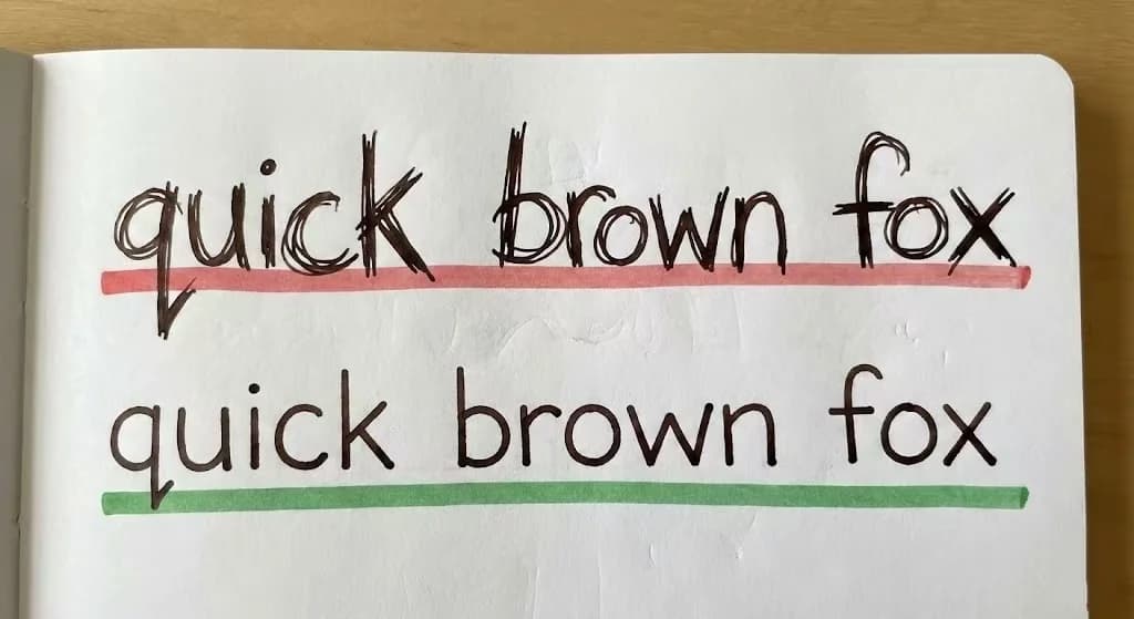
Why Do Neat Papers Consistently Score Higher?
It’s not bias —it’s your brain’s energy-saving mechanism, known as Cognitive Fluency. When graders encounter messy handwriting, their prefrontal cortex must work harder to decode the meaning, creating micro-frustration that subconsciously affects their judgment.
“Readers not only find the experience frustrating but subconsciously judge the author to be less intelligent.”
—Daniel M. Oppenheimer, Princeton University (2006).
From the study: Consequences of Erudite Vernacular Utilized Irrespective of Necessity.
This reveals a subconscious “Attribution Error” in graders: they associate messy handwriting with disorganized thinking, even when the content is excellent.
| Variable | Low Legibility (Messy) | High Legibility (Clean) |
|---|---|---|
| Brain Processing | High LoadUses prefrontal cortex to "guess". | Low LoadInstant visual processing. |
| Psychological State | Micro-frustration, anxiety. | Sense of flow and mastery. |
| Subconscious Judgment | "The student is confused." | "The student is smart." |
How Can You Refactor Your Handwriting for Better Scores?
Applying the Pareto Principle (80/20 Rule), you only need to fix the 20% of errors (like unclosed loops) that cause 80% of the ambiguity. Focus your practice on the high-impact issues first.
Why Is Loop Closure the First Thing to Fix?
Most legibility issues stem from unclosed loops. ’a’ becomes ’u’, ’d’ becomes ’cl’. Use the Print Worksheet Generator to drill these specific micro-movements.
How Does AI Analysis Help You Improve Faster?
You don’t need to guess where your structure is failing. Our AI Handwriting Analyzer scans your writing samples to measure vertical consistency and x-height alignment. It treats your handwriting as a dataset, identifying the specific “noise” that interferes with your “signal.”

Our AI detects structural flaws and provides detailed diagnostic reports highlighting baseline stability, slant inconsistency, and letterform collapse.
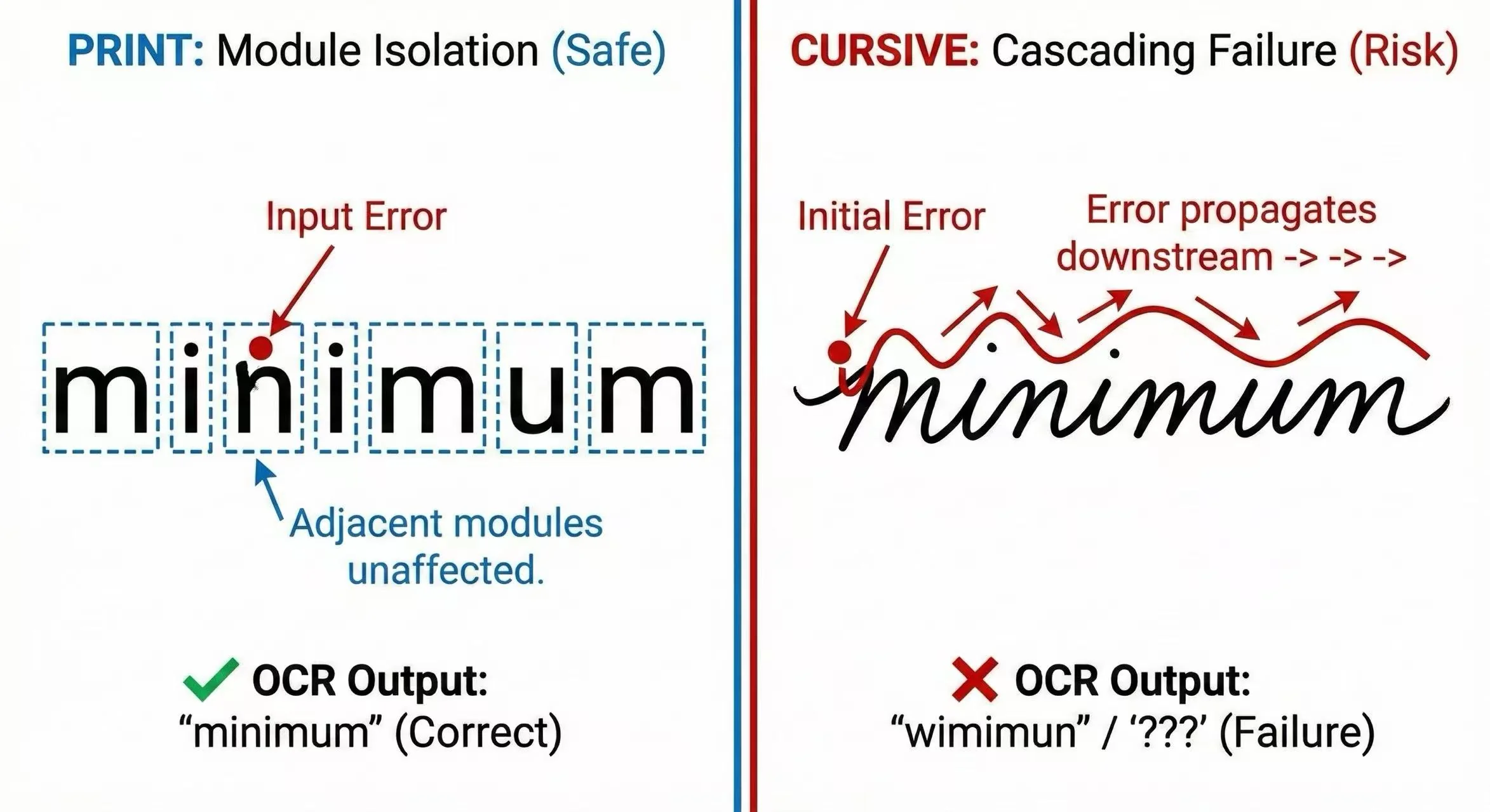
The Strategic Case for Print Script in Exams
In high-stakes environments like exams, your primary goal is Data Integrity, not artistic expression. While cursive writing may feel faster or more “sophisticated,” it introduces variable connections that significantly increase the risk of OCR segmentation faults and human misinterpretation.
From an engineering perspective, Print Script (Block Letters) is the superior protocol for standardized testing. It enforces high character separation, reducing the “noise” between letters and maximizing the chances that your intended meaning is transmitted accurately.
Final Recommendation:When the grader’s cognitive load is high, do not force them to decrypt your style. Switch to a clean, vertical Print style to ensure 100% packet delivery. Save the stylistic flair for your signature —use Print for your grades.