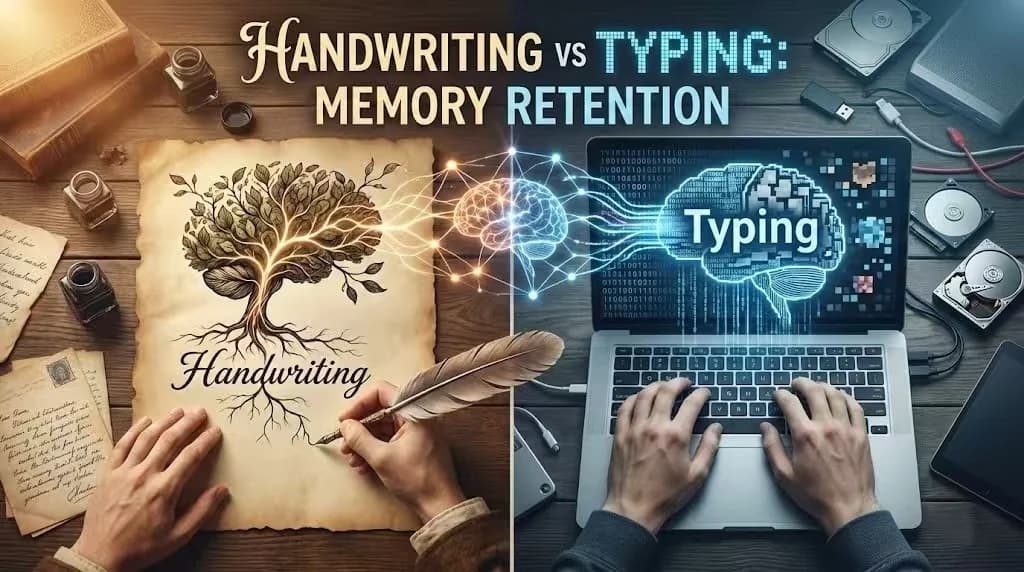
You wouldn't trust a banking website that used Comic Sans and mismatched buttons. Similarly, your professor or boss subconsciously judges the quality of your ideas based on the quality of your interface—your handwriting.
Quick Answer
Why is good handwriting important?
Good handwriting triggers a cognitive bias called the 'Halo Effect' — readers unconsciously rate neatly written content as more intelligent, credible, and competent. Studies show exam papers with legible handwriting score 1.0–1.5 grade points higher than identical content written messily.
Why Does Visual Quality Affect How We Judge Ideas?
There is a well-documented phenomenon known as the Halo Effect. When a document looks organized, the reader subconsciously assigns higher value to the data written inside it.
But why does this happen? It's not just about “art.” It's about processing power.
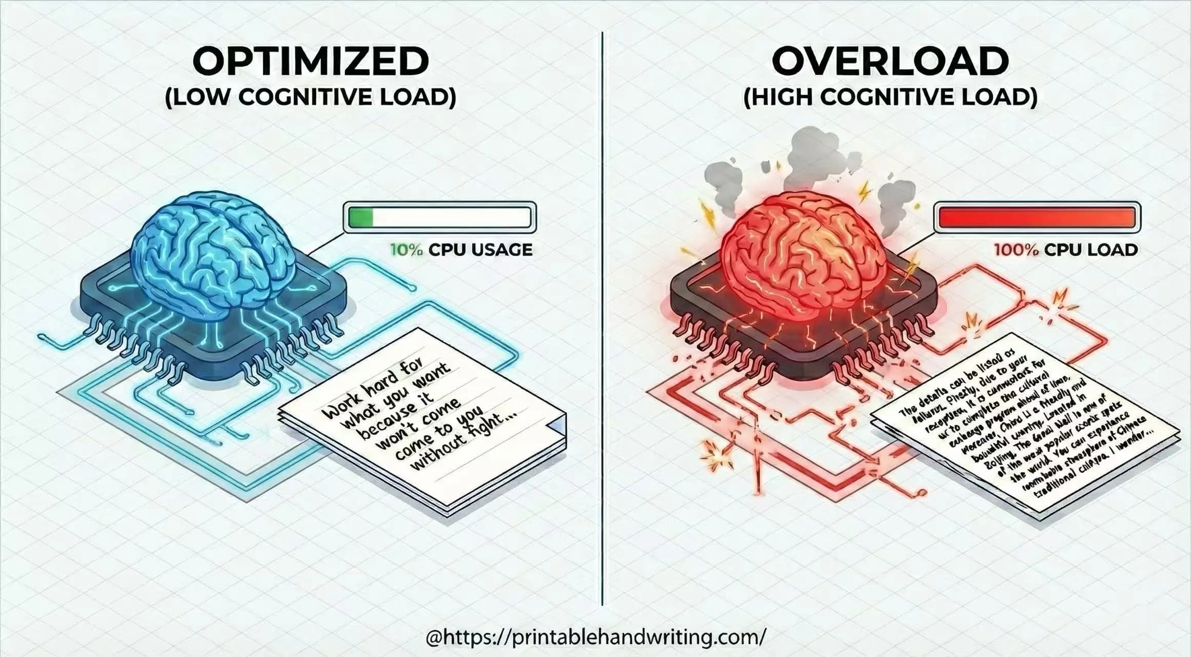
How Does Handwriting Affect Brain Processing?
According to Cognitive Fluency theory, the human brain acts like a GPU with limited resources. It constantly calculates the “energy cost” of processing incoming visual data.
The Latency Equation:
- Low Latency (Neat): Brain recognizes patterns instantly —surplus energy is used to understand your logic.
- High Latency (Messy): Brain struggles to decode shapes —CPU spikes —reader feels subconscious “pain” or frustration.
When your handwriting is messy, you are essentially forcing the reader's brain to run a heavy error-correction algorithm. This creates Cognitive Friction. The reader might not say “this is ugly,” but they will feel “this is hard to understand,” and they will blame your content, not just your penmanship.
Why Is Handwriting Legibility About Layout, Not Just Letter Form?
Many people think they have “bad handwriting” because their individual letters are ugly. As a developer, I can tell you: It's usually not a font issue; it's a layout issue.
In Gestalt Psychology, the Law of Proximity states that objects near each other are perceived as a group.
- Kerning (Letter Spacing): If letters are too far apart, the word falls apart.
- Padding (Line Height): If lines touch each other (ascenders hitting descenders), it creates a “Wall of Text” bug.
If you struggle with this, your internal “Grid System” is broken. You don't need to practice drawing circles; you need to practice margin control.
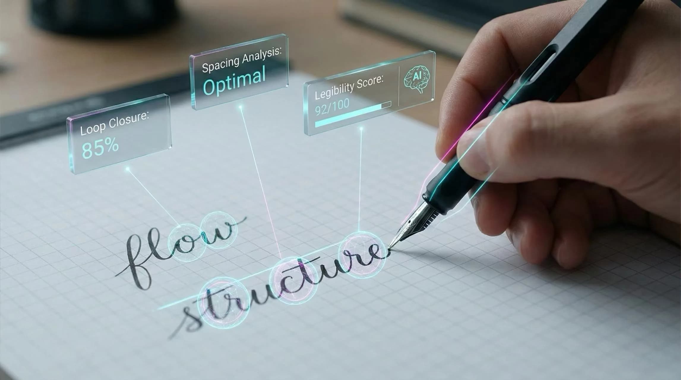
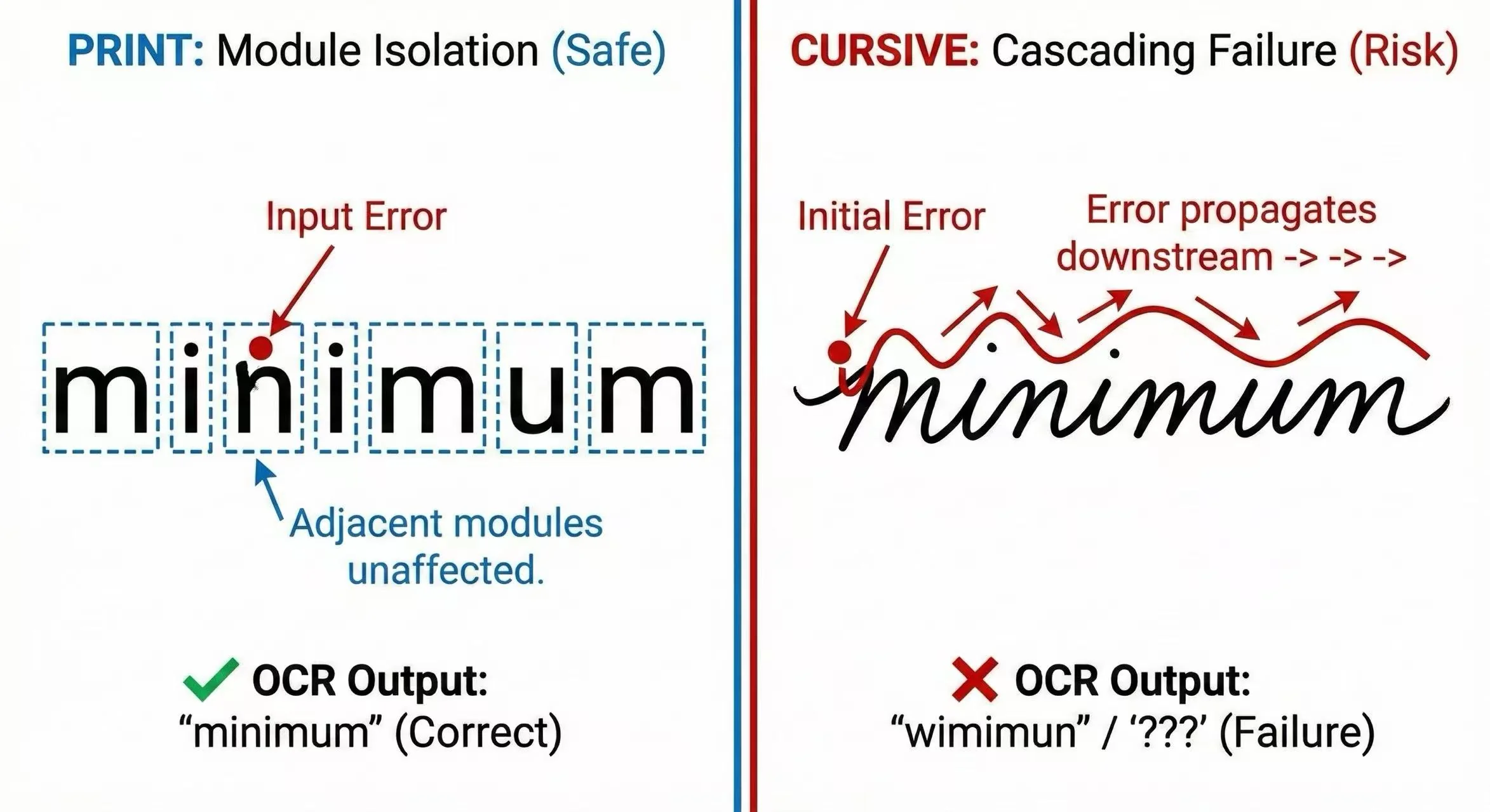
How Does Handwriting Quality Affect AI and Digital Reading?
In Information Theory, communication is about transmitting a signal through a noisy channel. Your handwriting is the signal. Inconsistency is the Noise.
We are moving into an AI-first world. Exams are increasingly graded by AI scanners. Notes are digitized by OCR (Optical Character Recognition) apps like Notion or Evernote.
If an AI cannot read your writing, your data is effectively lost (Packet Loss).
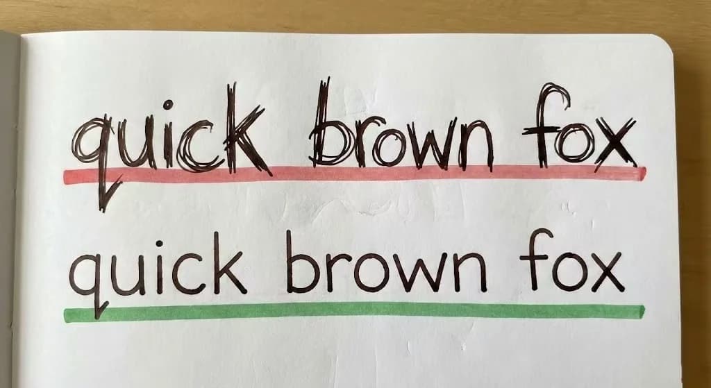
Visual Benchmark: The “Signal” Integrity

Result: High chance of OCR failure or human misinterpretation.

Result: Zero latency reading. 100% data recovery.
What Common Handwriting Issues Affect Professional Impressions?
Based on the theories above, here is how specific “bugs” in your handwriting code translate into professional impressions.
| Bug Type | Visual Symptom | User Impression |
|---|---|---|
| padding-bottom: 0px | Touching lines (Tangled) | Disorganized. Creating visual clutter. |
| align-items: random | Wavy Baseline | Unstable. Lacks grounding/confidence. |
| font-family: inconsistent | Mixed slant/sizes | Chaotic. Hard to predict, hard to trust. |
| Optimization Pass | Consistent Spacing | Professional. Respects the reader's time. |
How Can You Improve Your Handwriting?
You don't need to be an artist. You just need to debug your output. Start by identifying your biggest bottleneck. Is it spacing (layout)? Or letter formation (component rendering)?
If spacing is your issue, use our print handwriting worksheets to practice with guided templates that enforce consistent margins and letter spacing.
Ready to Improve Your Handwriting?
Practice with guided templates that enforce consistent spacing and proper letter formation. Structured worksheets help build muscle memory for lasting improvement.
Free to create worksheets. AI analysis first check is free.