Quick Answer
Should I learn print or cursive first?
Print first, then cursive. Handwriting follows a developmental hierarchy: print builds foundational letter recognition and fine motor control, while cursive adds fluid connections between letters. Skipping print and jumping to cursive is like learning to run before you can walk — the underlying motor patterns aren't yet established.
Why is print the prerequisite for cursive?
Many beginners fall into a logical trap: “My print handwriting looks childish, so I will learn cursive to hide it.”
This is incorrect. Cursive is simply Print played on “Hard Mode.”
- Print (Discrete System): Every letter is a separate module. When you finish a letter, you lift the pen. This Micro-pause is crucial—it is an event where your brain performs “Auto-Calibration,” resetting coordinates for the next character.
- Cursive (Continuous Flow System): You remove the lift-off calibration. You must execute a complex string of vectors without any reference points.
If your muscle memory hasn't established absolute coordinates via Print, your cursive will drift. You aren't creating flow; you are compounding errors.
Before choosing your branch, you can run a quick handwriting evaluation to see whether your current bottleneck is structure, spacing, or slant.
What is the print stage and why does it matter?
Objective: Accuracy > Speed. Establish immovable Anchor Points.
In this phase, ignore style. Focus entirely on the Geometry. You need to verify that your 'a' closes perfectly and your 'h' stands vertically.
Recommended Tool: Edu SA Hand
Available in the Print Generator (open counters, zero slant for beginners).
How does the bridge protocol work?
Jumping from basic print to Allura is too big a gap. You need middleware.
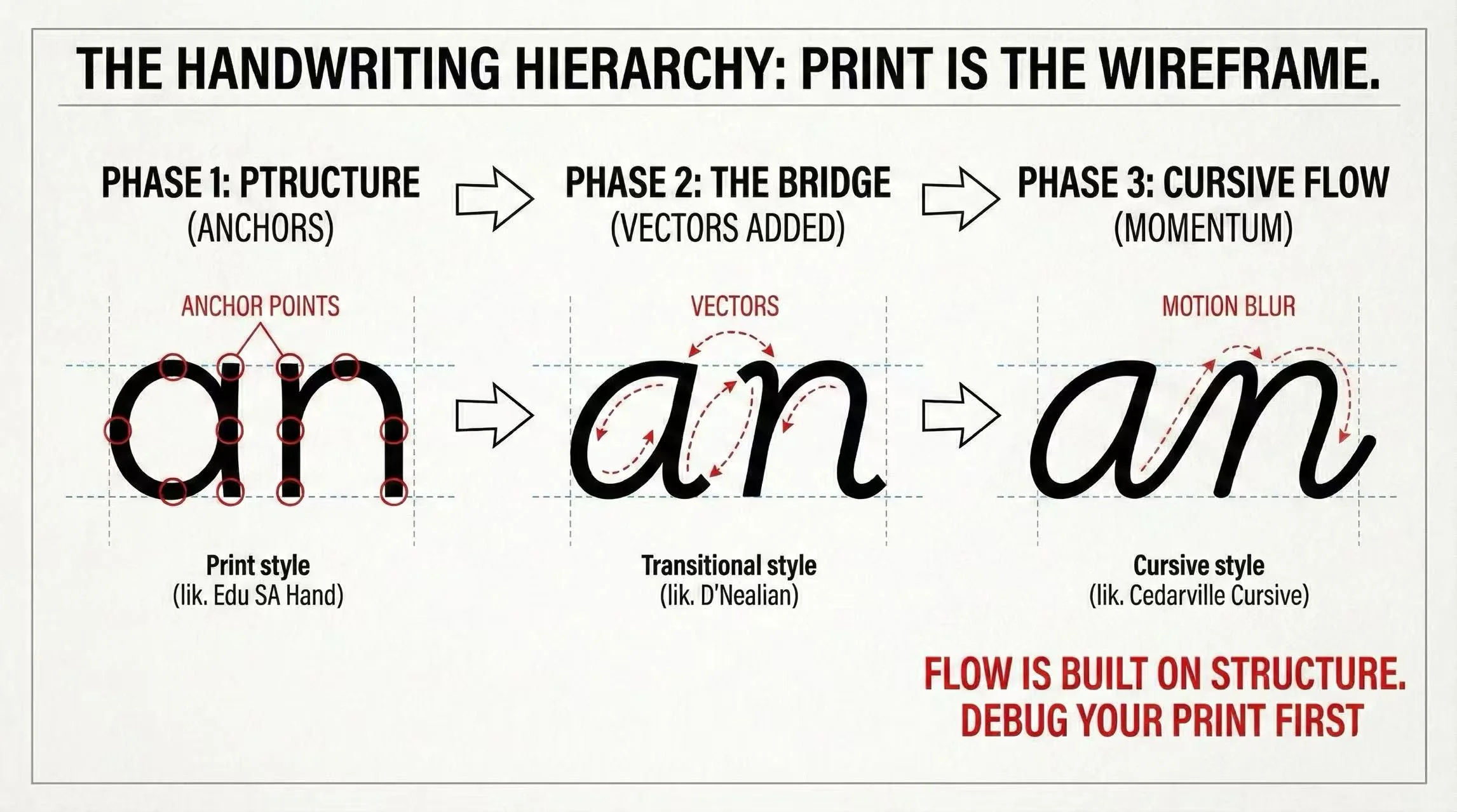
Recommended Tool: D'Nealian
The Engineering Logic: It adds "Monkey Tails" (vectors) to standard print. You are reducing the Input Lag between letters without forcing full connection yet.
Available in the Cursive Generator.
Which cursive style should I choose?
Once structure is stable, choose your output protocol:
Minimalist. Reduces "travel distance". Looks like a doctor's handwriting but legible.
High cognitive load. Extreme slant. Use only for titles, never for long-form study.
Speed Benchmark: Structure is solid, but is Cursive actually faster? We ran the numbers.
Check out our engineering comparison: Cursive vs. Print: The Efficiency Benchmark →
The Advanced Solution: See Exactly What's Wrong
Standard advice (like the fonts above) works for the 80% use case. But handwriting is bio-metric. Print doesn't have to be "boring"—it can be playful like Itim. Cursive doesn't have to be "wild"—it can be restrained like Playwrite AU SA.
Don't guess which style fits you. Our AI analyzes your handwriting across five dimensions—legibility, consistency, fluency, structure, and pen control—to produce a detailed diagnostic report with visual issue mapping and kinematic findings.
Which font should I start with?
Based on your current skill level, here is the recommended starting font:
| User Status | Pain Point | Recommended Font |
|---|---|---|
| Newbie | Shaky lines, inconsistent sizing | Edu SA Hand |
| Intermediate | Want to connect, but looks messy | D'Nealian |
| Pro | Need speed for notes | Cedarville Cursive |
Start practicing with Edu SA Hand using the Print Generator.
Summary: The 80/20 Rule
Spend 80% of your practice time on print using Edu SA Hand. Fix the bugs in your structure.
Once the structure is clean, the remaining 20% is just connecting the dots using D'Nealian. You will find that "flow" is a natural byproduct of good structure, not something you force.