Handwriting Guides & Research
Evidence-based handwriting improvement articles covering problem diagnosis, training systems, style comparisons, and the science behind penmanship. Each guide is designed to be actionable —apply one idea at a time and measure your progress.
Not sure where to start? Get a free AI handwriting analysis to identify your specific challenges, then pick a guide that targets them.
Browse by topic
Find articles based on your goal
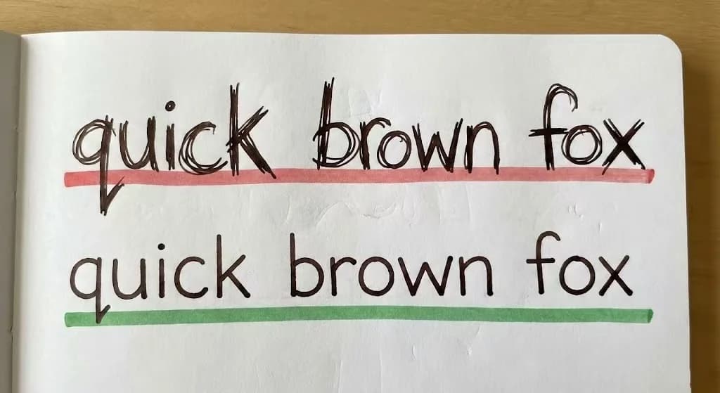
Problem Fixes
Articles that diagnose specific handwriting issues and provide targeted solutions
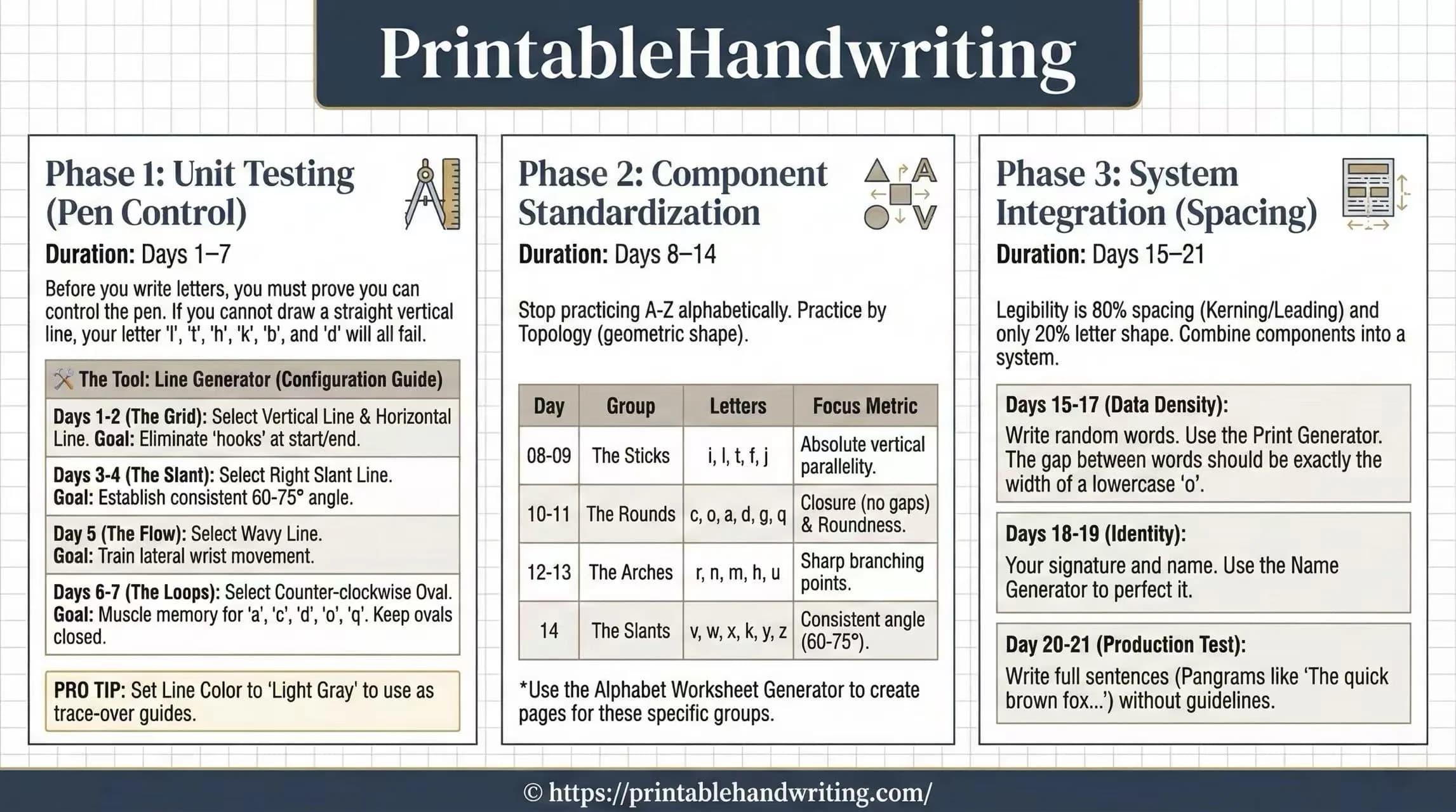
Training Plans
Structured schedules and step-by-step programs for consistent improvement
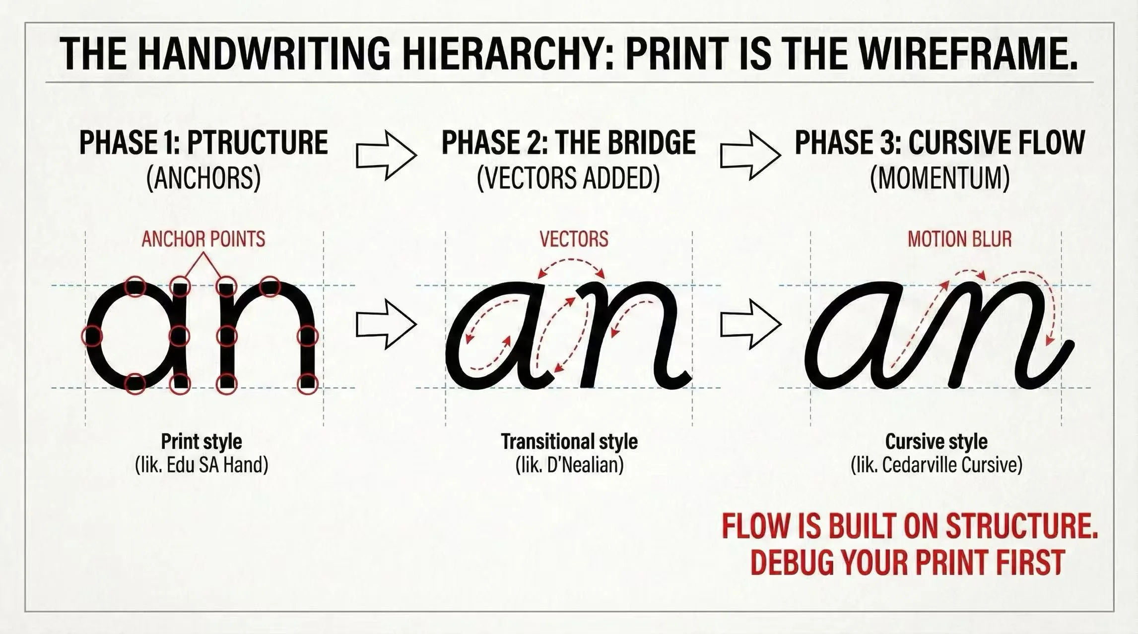
Style Comparisons
Side-by-side analysis to help you choose the right handwriting style

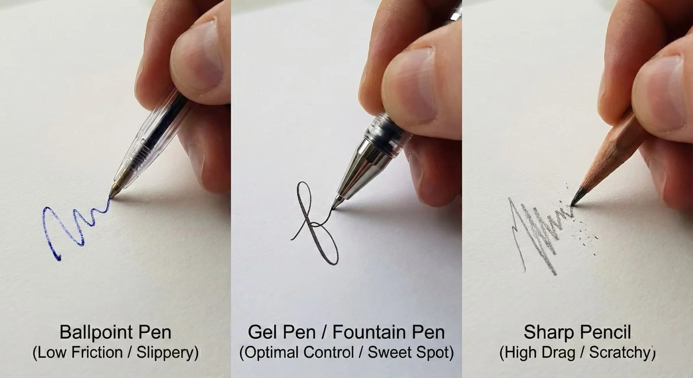
Research & Science
Cognitive science, ergonomics, and equipment research for evidence-based improvement


Tools & Methods
Technique guides and method articles for specific use cases

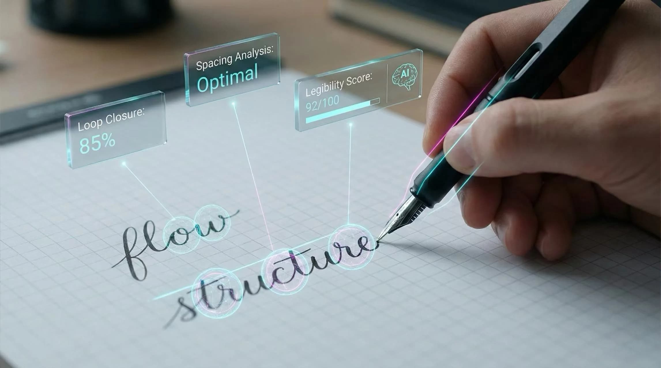
Ready to understand your handwriting?
Get a free AI-powered analysis of your handwriting. Upload a sample and receive a detailed report covering legibility, consistency, fluency, structure, and pen control —plus a personalized 21-day training plan.