Aesthetics & Cognitive Science
Why Your Handwriting Looks "Bad": The Science of Visual Entropy
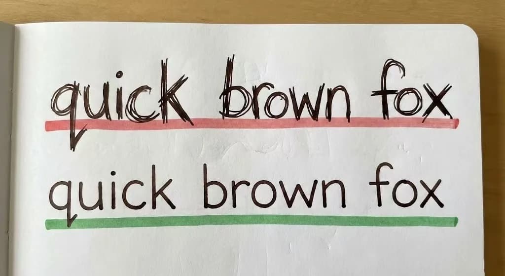
Handwriting aesthetics is not art; it is math. Discover how "Slant Entropy" and "Baseline Drift" ruin your visual consistency.
8 min readRead Article
Deep dives into the mechanics of legibility, the psychology of penmanship, and practical handwriting practice strategies for students and professionals.
This blog is organized around practical outcomes: cleaner letterforms, better speed-legibility balance, stronger pen control, and more reliable practice habits. Each article is written as an actionable guide, so you can apply one idea at a time instead of changing everything at once.
For best results, combine reading with worksheet practice: choose one article, run one focused drill for a week, and track before/after samples to measure improvement.
Handwriting aesthetics is not art; it is math. Discover how "Slant Entropy" and "Baseline Drift" ruin your visual consistency.
Stop practicing your signature letter by letter. Discover the biomechanics of motor chunking and refactor your professional signature for maximum efficiency.

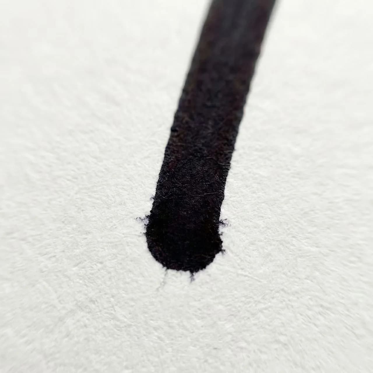
Why do lefties struggle with smudging? It's a physics bug. Learn how to fix it using the "45-degree Rotation Patch" and custom grid generation.
Is the Apple Pencil ruining your handwriting? An engineering analysis of Friction Coefficients, Input Latency, and why paper GSM matters for motor control.
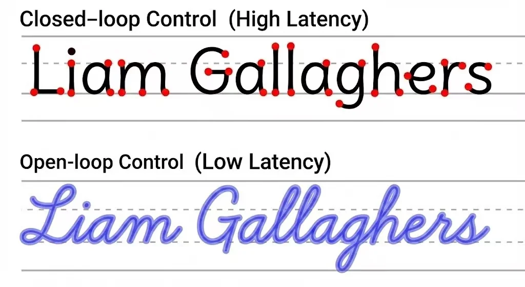
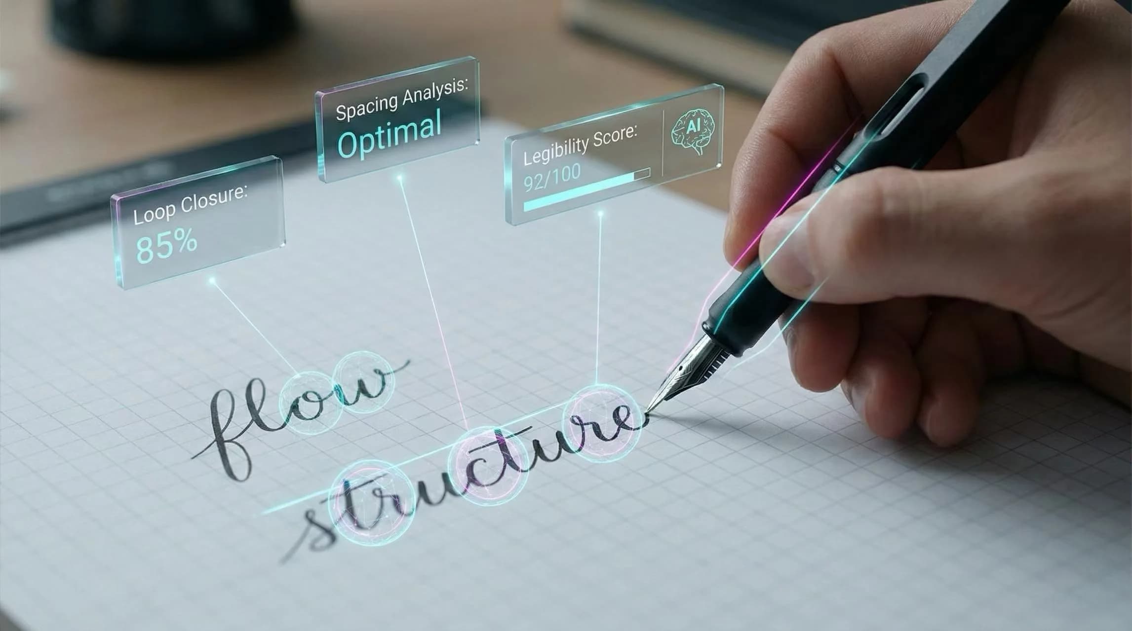
Your handwriting is an interface. Discover how "Render Latency," "Signal-to-Noise Ratio," and Gestalt principles affect how your work is judged by humans and machines.
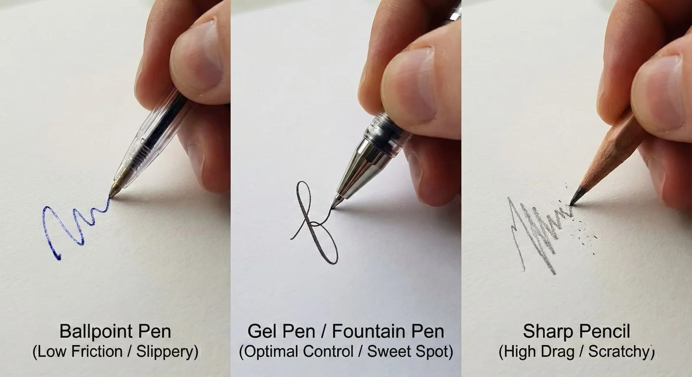
Which pen offers the best control? We analyze ballpoint vs gel pens using Friction Coefficients, Damping, and Overshoot. Includes a Jitter Test Protocol.
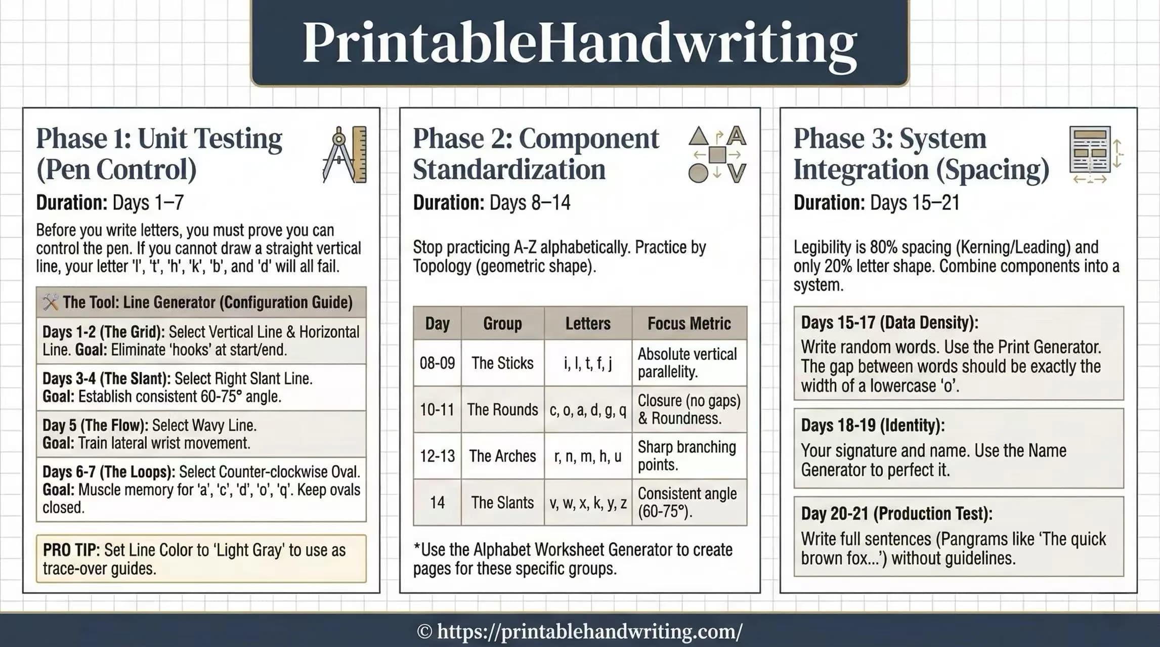
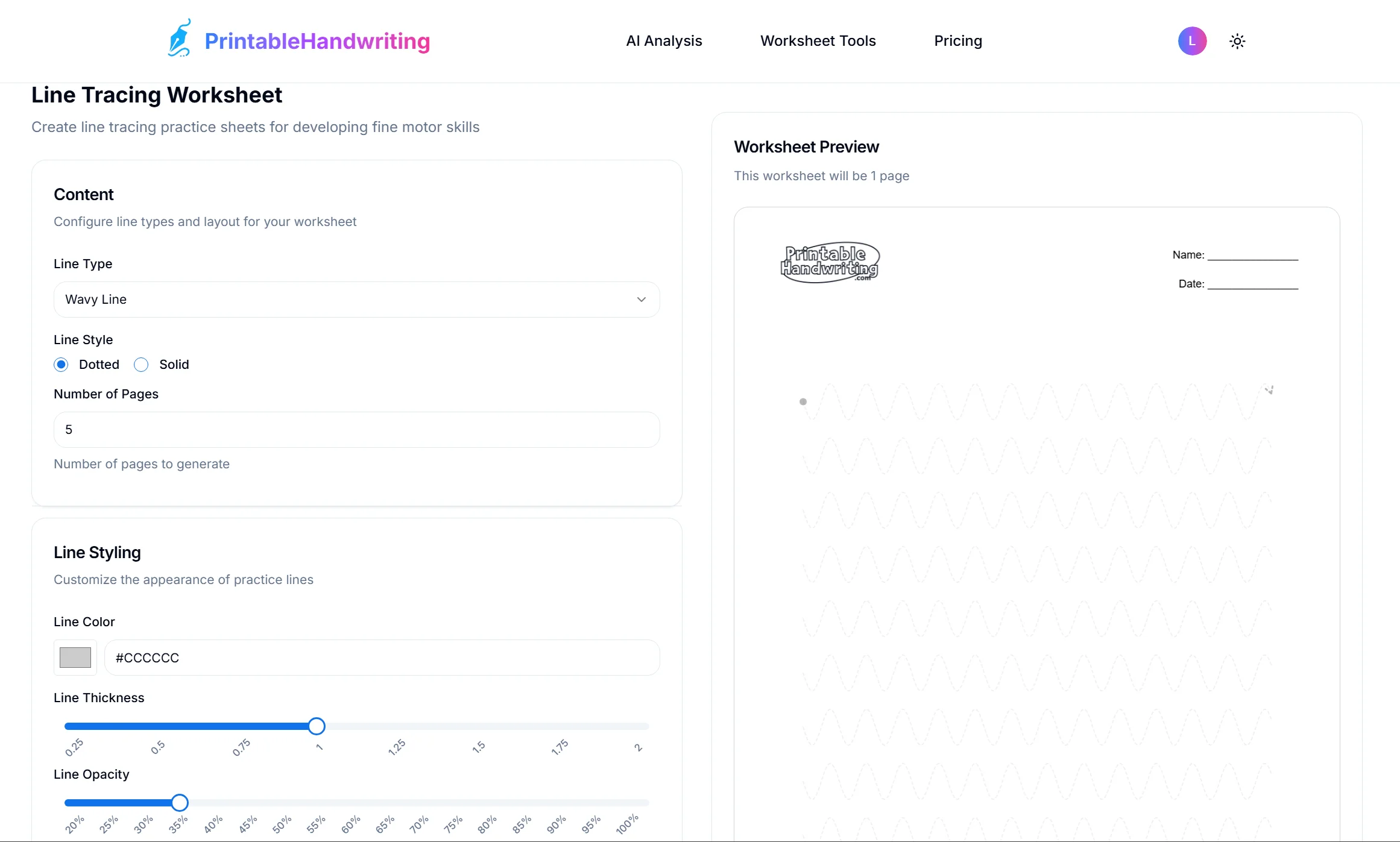
A structured handwriting training program designed to reprogram your muscle memory. Daily drills for consistent improvement in legibility and speed.
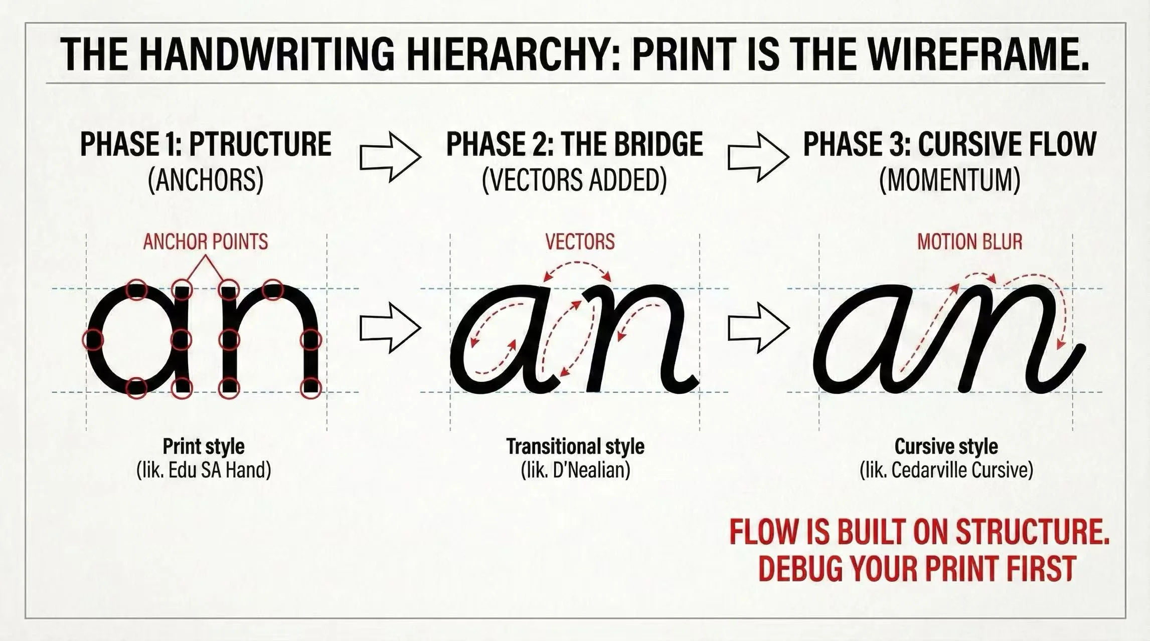
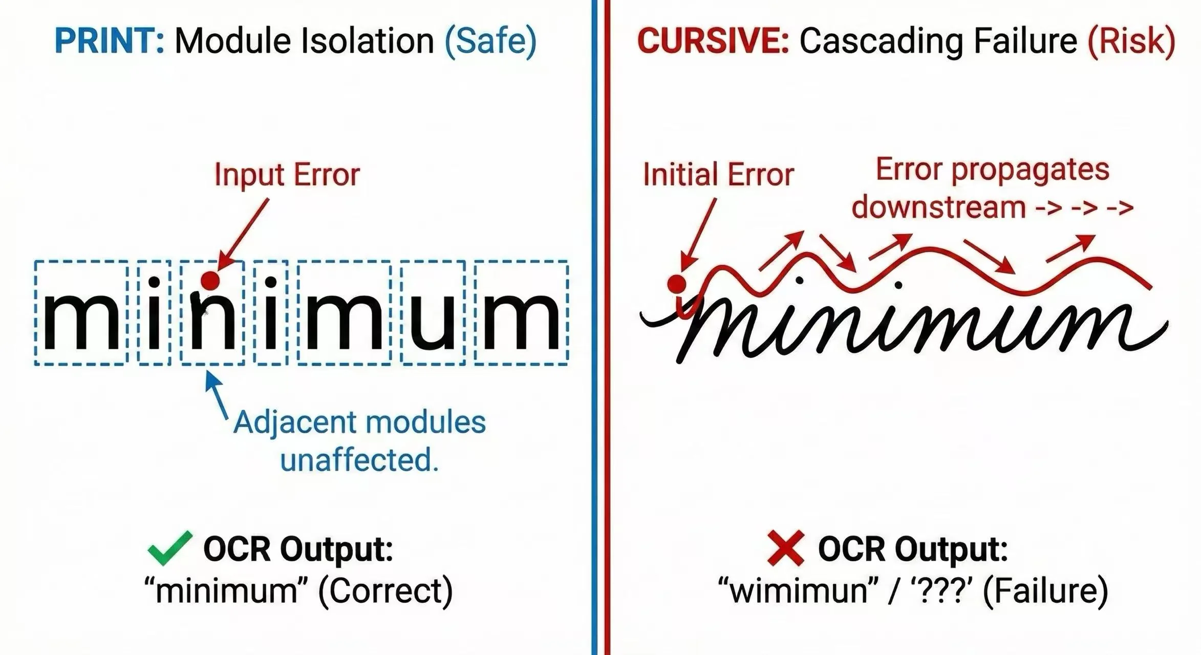
Analyze the mechanics of cursive and print handwriting. Which style offers better speed and legibility? We benchmark the data.
We tested 100+ samples to find the optimal balance between writing speed and legibility. See the results of our handwriting practice research.
Hand pain slowing you down? Learn the biomechanics of a proper grip to extend your handwriting practice sessions without fatigue.
Don't lose marks to bad penmanship. Statistics show a correlation between clear handwriting and higher test scores. Engineer your writing for success.
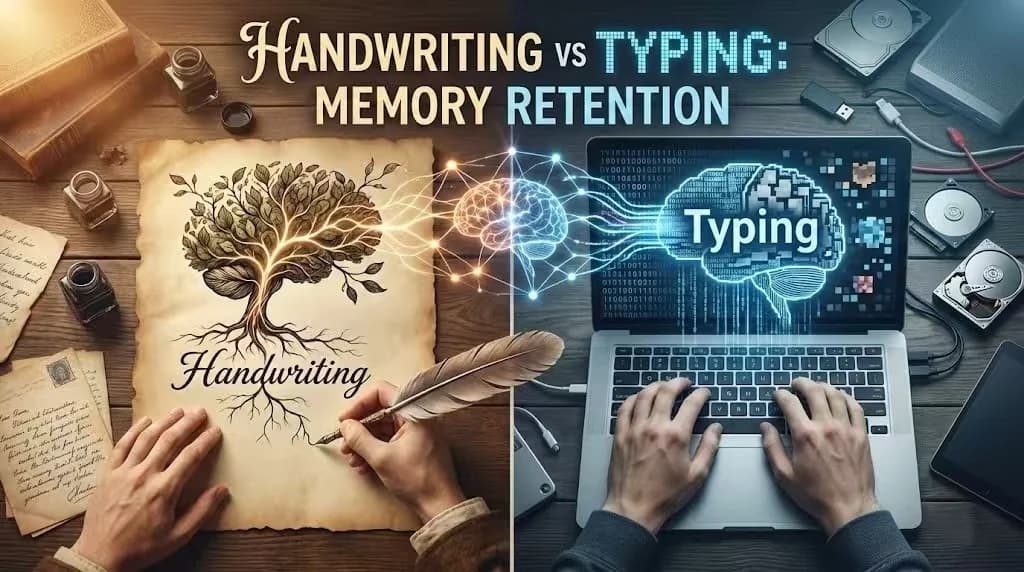
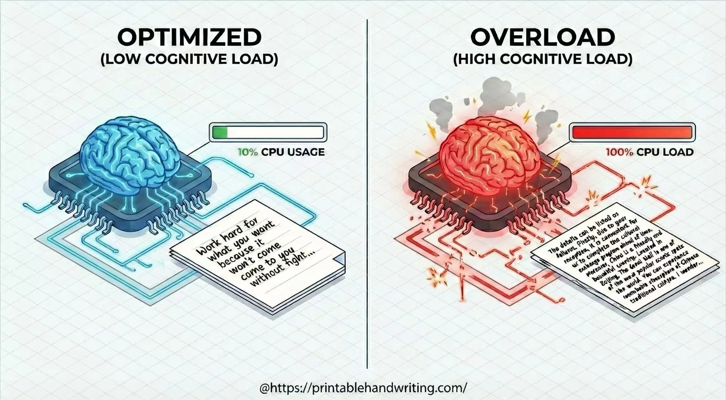
Why writing by hand boosts memory retention compared to typing. The cognitive science behind handwriting training and learning efficiency.
Join thousands of users using our AI tools for effective handwriting training. Get instant analysis and personalized practice sheets.